If you’re reading this, I’m sure you already know some of the key ingredients of successful speaking businesses. There’s modern branding to help catch event organizers’ attention, speech descriptions to explain your value, and your speaker reel to demonstrate your speaking skills. But how do you effectively maintain each of these components without breaking the bank? Perhaps even more importantly, how do you do it without wasting potential clients’ time? Two words: speaker websites.
Although it may seem a relatively unoriginal idea to create a website, the fact remains that 47% of people will visit a company website before making a purchase. That includes everyone from former members of your audience, looking to buy your book, to new leads, considering whether or not they want to hire you for their event.
Additionally, after landing on your website, the average visitor forms an opinion on it in 50 milliseconds (0.05 seconds). In other words, in less than a second, they decide if you’re credible and if they’re going to continue reading.
With that in mind, well-designed speaker websites remain one of the key factors that differentiate speakers effortlessly getting booked from those just making it by. Here, we’ll break down 25 of our favorites,
1. Brittany Hodak
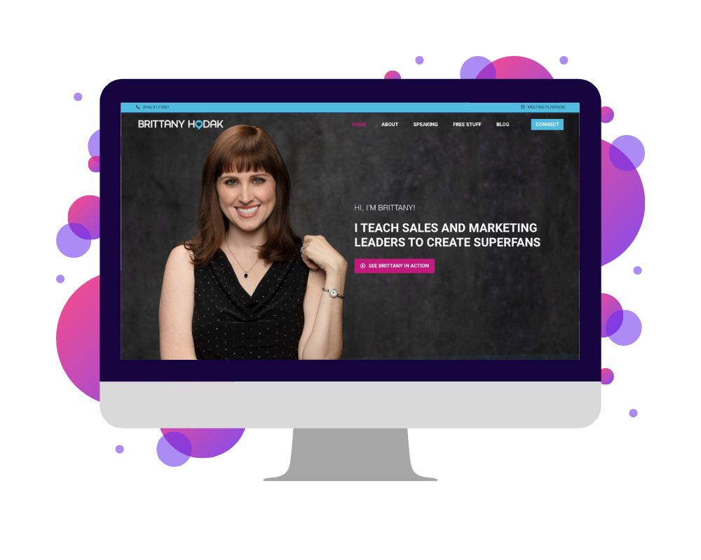
First in our list of speaker websites is that of keynote speaker and renowned “superfan expert” Brittany Hodak. As a speaker, one of the things that makes Brittany stand out is her forward-thinking and optimistic personality, a quality that is clearly communicated in the overarching design of her website. However, it also meets many of the most important criteria for a well-constructed website. These include clear calls to action throughout the site, easily accessible videos of “Brittany in Action,” and concisely stated reasons that hiring Brittany is guaranteed to pay off. Plus, the entire site was designed by the SpeakerFlow team, so you know it was made with some pretty high standards in mind. 👌
What You Should Steal: Her Meeting Planners Page
Want one sure thing to make event organizers hire you? Make the hiring process as simple and convenient for them as possible. On Brittany’s website, we see this on her Meeting Planners page, which includes various resources for anyone including her at their event. Likewise, on your own website, dedicate a page to all of the things you know your clients will need. That way, they can easily access it all in one place and, seeing how organized you are, they’ll know hiring you once (or over and over) will be a breeze.
2. Cassandra Worthy
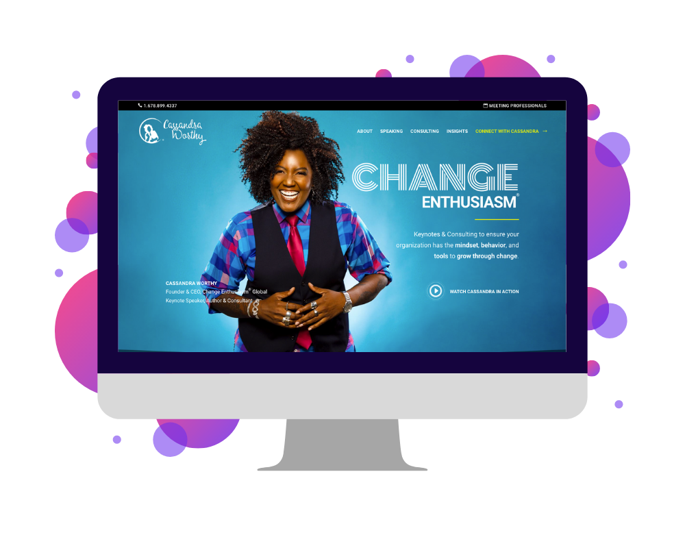
Number 2 of our speaker websites is owned by speaker and CEO of Change Enthusiasm® Cassandra Worthy. One of the most recently updated in this list, Cassandra’s site was completely redesigned in 2019 by Video Narrative along with her speaker reel and all of her speaking collateral for event organizers. Like Brittany Hodak, her site features eye-catching, modern branding, consistent calls to action, and a “Meeting Planners” page to simplify her clients’ hiring experience. It also does an exceptional job of engaging the viewer without overwhelming them, thanks to subtle animations carefully balanced “pops” of color.
What You Should Steal: Her Brand Consistency
Like any small business, a speaking business isn’t just about you – the owner – and your team. Even though it probably features your photos fairly frequently, it’s also about your branding! Like Cassandra, your site should use colors, fonts, and styles that reflect your personality and your tone during speaking engagements. Maybe you’re bold and striking, like her, or more laid back and bubbly, like Brittany Hodak. Either way, make sure your website design reflects you and is consistent throughout every aspect of your speaking business.
3. Christine Hassler
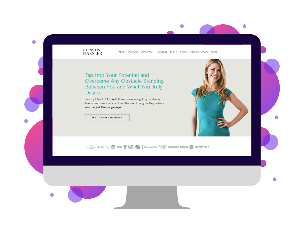
The third website we’ll look at belongs to speaker, author, and life coach Christine Hassler. Compared to the two previous speaker websites in this list, Christine’s may seem “old-school,” at least where design is concerned. Nevertheless, like the others, it meets all of the requirements for a high-quality site. Calls to action? Check. Consistent branding and language? Check. Clear communication of her speaking programs and additional offerings? Check and check! It also features an enticing lead magnet, placed throughout the site and in a pop-up window, which states “Take my Over It & On With It assessment and get crystal clear on how to overcome whatever is in the way of living the life you truly want”.
What You Should Steal: Her Lead Capture Mechanism
Many speakers miss out on leads simply because their website isn’t built to capture them effectively. When you land on Christine’s home page, however, you’re greeted with a pop-up offering the aforementioned “free assessment”. Then, as you scroll through her site, the offer is repeated, which prompts you for a first name and email after you click the “Take Your Free Assessment” button. This allows her to collect your contact information in return for her free resource. From there, she can add you to her mailing list or (if you’re an event planner) contact you directly. On your own site, you can do the same. All it takes is a free resource (quiz, PDF, etc.) some spots on your site to promote it, and voila! 🎉
4. Dan Thurmon
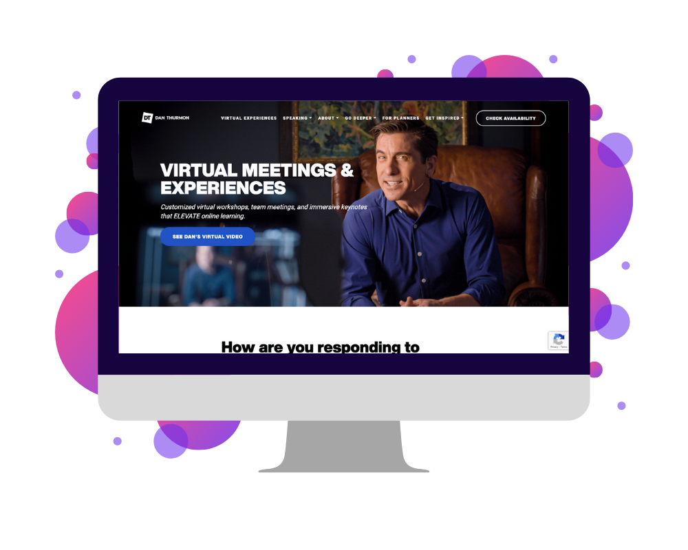
Fourth in our list of speaker websites is that of keynote speaker and corporate coach Dan Thurmon. Compared to the three previous examples in this list, which focus primarily on speaking for live events, Dan’s website centers around his virtual offerings. These include, as he puts it, “virtual meetings and experiences” such as keynotes, workshops, and other engagements designed to bring teams together. Still, like any good speaker website, he also includes information about similar programs for live audiences, all of which is similarly communicated through a clean-cut, modern design.
What You Should Steal: His Simplicity
Speaking of design, Dan’s website is a perfect example of how to provide information concisely and effectively. For many business owners – speakers included – it can be tempting to approach websites with a “more is more” attitude. But, in reality, the “less is more” approach is a bit of a cliche for a reason: it works. If you want to be hired, you should share details about your keynotes, your background, and the outcomes of your programs but balance all with plenty of space and images (or graphics) to break up the text. Like Dan’s site, keep in mind that simplicity is key. The best way to communicate your value is to keep things clear and to the point.
5. Debra Benton
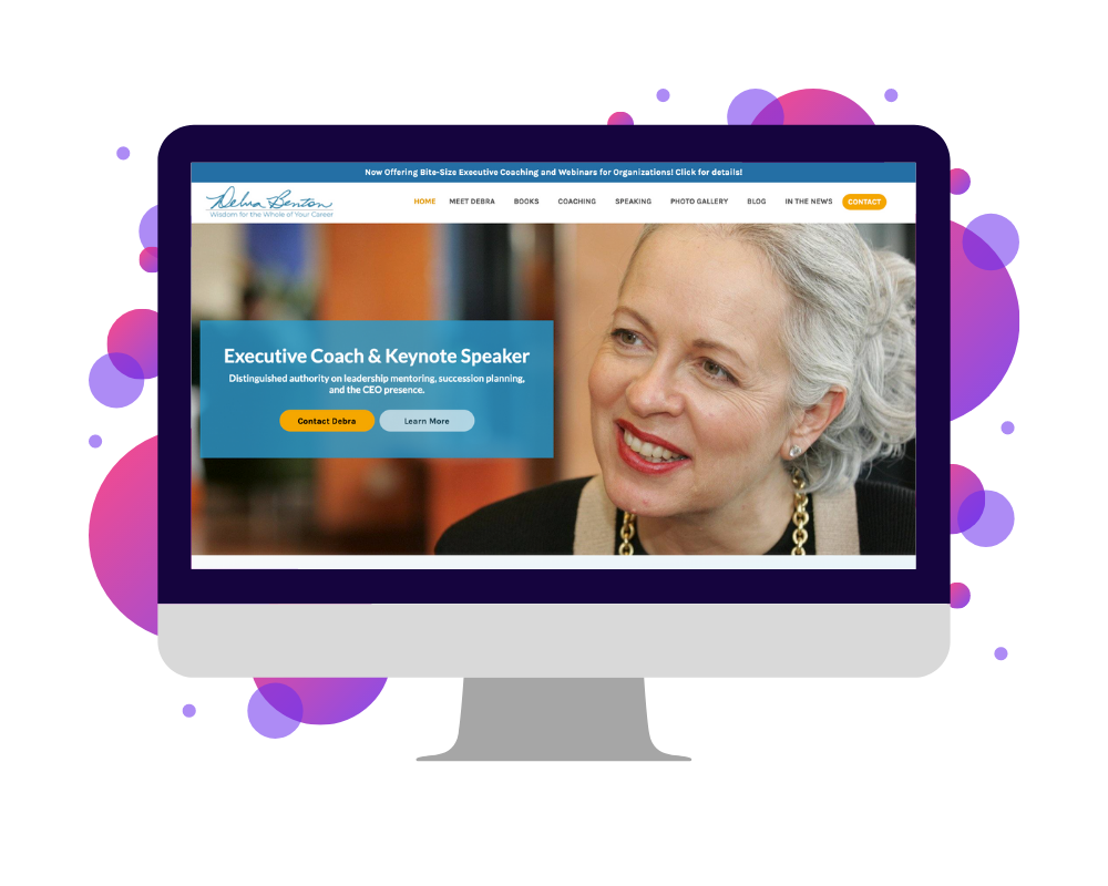
The next speaker website we’ll look at is owned by speaker, author, and executive coach Debra Benton. Built by technology firm Candid Goat, Debra’s website may be one of the older examples in this list. However, considering Debra’s 30+ years of experience in the speaking industry, it’s also a wonderful resource if you’re considering how to scale your speaking business to offer coaching and educational resources (in Debra’s case books) in addition to your speaking programs. It’s also another great example of balancing text with images or video, when communicating your value. Like Dan Thurmon’s site, it shows that simplicity – in branding, message, and design – always works.
What You Should Steal: Her Coaching Page
One specific page to review on Debra’s site is her “Executive Coaching” page. Especially if you’re wondering how to argue your worth without overwhelming the reader, this page can serve as a template of sorts. A few distinct attributes to keep in mind include her use of icons at the top of the page, her description of “Eleven commitments you can expect when you hire me,” and her clear explanation of “How Executive Coaching Benefits the Entire Organization”. Combined, these components allow an executive to clearly see not just what they get when they hire Debra but also why it’s well worth the investment for their team as a whole. In the same way, your own pages should quickly and clearly outline your worth in the long term, not solely for a single event or audience.
6. Gene Hammett
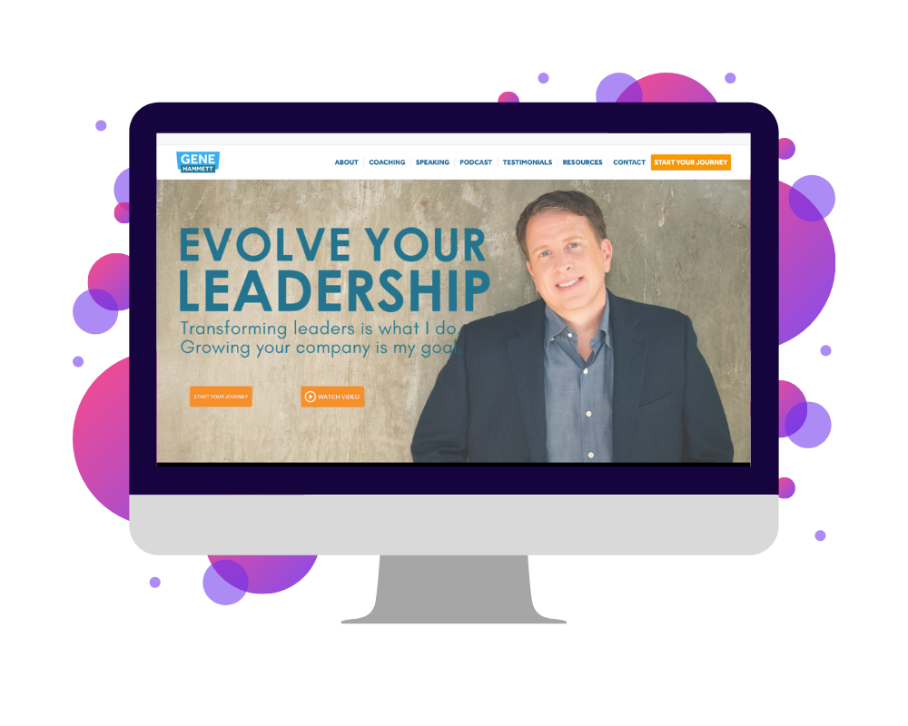
Number 6 of our speaker websites is that of leadership coach and speaker Gene Hammett. Like the aforementioned examples in this list, Gene’s website ticks all of the boxes for a good speaker website. Design-wise, it’s clean and modern. As far as information goes, it explains what he speaks about and what presentations he offers, and, in terms of results, it plainly outlines the value of his programs. Relative to some of the other websites here, it also provides a greater amount of evidence for the thought leadership behind his business. This can be seen in his podcast, his free “Resources” page, and his contributions to several notable business publications, such as Forbes and Business Insider.
What You Should Steal: His Hero Section
When someone lands on your website, a huge part of getting them to continue scrolling depends on the first thing they see, usually called the “hero” section. On Gene’s site, this portion consists of four critical things to engage website visitors immediately. These include a statement of what the viewer wants (“Evolve Your Leadership”), an assertion he can make it happen (“Transforming Leaders Is What I Do”), a link to his sizzle reel, and a link to connect with him right off the bat. Ideally, your own website should also include these elements, the first two of which are similar to a promise statement. That way, event organizers can land on your site and see you’re the perfect fit for them in seconds.
[hubspot type=cta portal=5815852 id=4423b6b8-d7d0-4f03-b792-184db7c3284b]
7. Jacob Green
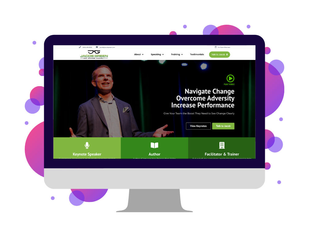
The seventh speaker website we’ll look at belongs to change management speaker Jacob Green. Another SpeakerFlow project, this site combines many of the “ideal” elements we’ve already covered in this guide, such as consistent and up-to-date branding, concise program descriptions and sales language, and eye-catching buttons throughout the site that urge the visitor to reach out. Additionally, like Gene Hammett’s site, Jacob’s features a promise statement and call-to-action button at the top of the “Home” page. Both of these encourage event planners to get in touch as soon as possible.
What You Should Steal: His Home Page
As far as our own website work is concerned, one of the questions we hear most frequently has always been, “What should I include on my website?” To be fair, this is a bit of a loaded question and the answer varies from speaker to speaker. That said, there are still a handful of sections you definitely want to include in one form or another on your website, all of which can be seen on Jacob’s “Home” page. If you’re unsure what to include on your site – or whether or not it’s up to standard as is – I definitely recommend looking his over and making sure your own homepage follows a similar layout.
8. Jason Dorsey
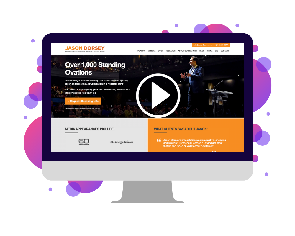
Next up of our speaker websites is that of general researcher and keynote speaker Jason Dorsey. Although the overall design of the site leaves a bit to be desired, Jason’s site remains one of the most jam-packed examples we’ll include here. In addition to the standard information you’d expect on a speaking website, it features not only free resources for event organizers (or fans) related to his speaking topics but also infographics and illustrations that summarize his reasoning, leading the site visitor to ask, “That’s interesting. Can you explain that a bit more?”
What You Should Steal: His Credibility
However, perhaps the most notable aspect of Jason’s site is that it’s the first in this list to highlight the research component of his work alongside his speaking skills. More than anything, the professional speaking industry stems from the idea of thought leadership. Here, Jason expertly leans into this by providing details about the work he’s put into researching his area of expertise, highlighting him as an authority in his field. Likewise, on your own website, remember that you’re an expert first and a speaker second. True – your speaking information is important. But, the more you can build your credibility first, the more valuable your speaking presentations will become.
9. Jason Redman
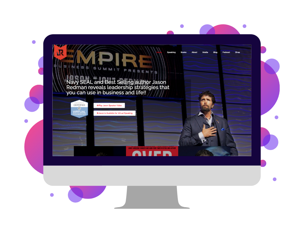
Ninth in our list of speaker websites belongs to speaker, author, and retired Navy SEAL Lieutenant Jason Redman. As a professional speaker and a business owner, Jason is known partly for his inspiring story but also for his unapologetic and fearlessly authentic approach to leadership and life, as a whole. These matter-of-fact and courageous attitudes are mirrored in every component of his site, including the color palette of his brand to the language of his speaking pages and presentations. They’re also, in large part, what makes Jason’s website so striking for event organizers.
What You Should Steal: His Individuality
This brings me to the question, “What should you copy from Jason’s site?”. To put it simply, the best speaker websites are hard to forget. Considering Jason’s site, there are a few things that stand out, such as his background and the events that led him to his current career path. But, there are also elements that apply to many speakers, like powerful and engaging language and, clearly, a real person behind the speaker attendees see on stage. When designing your own website, aim for the same level of personality and authenticity. Remember, your clients (and audience members) are looking to you for guidance, but they’re going to remember you better if you connect with them on a human level, too. 💓
10. Jay Baer
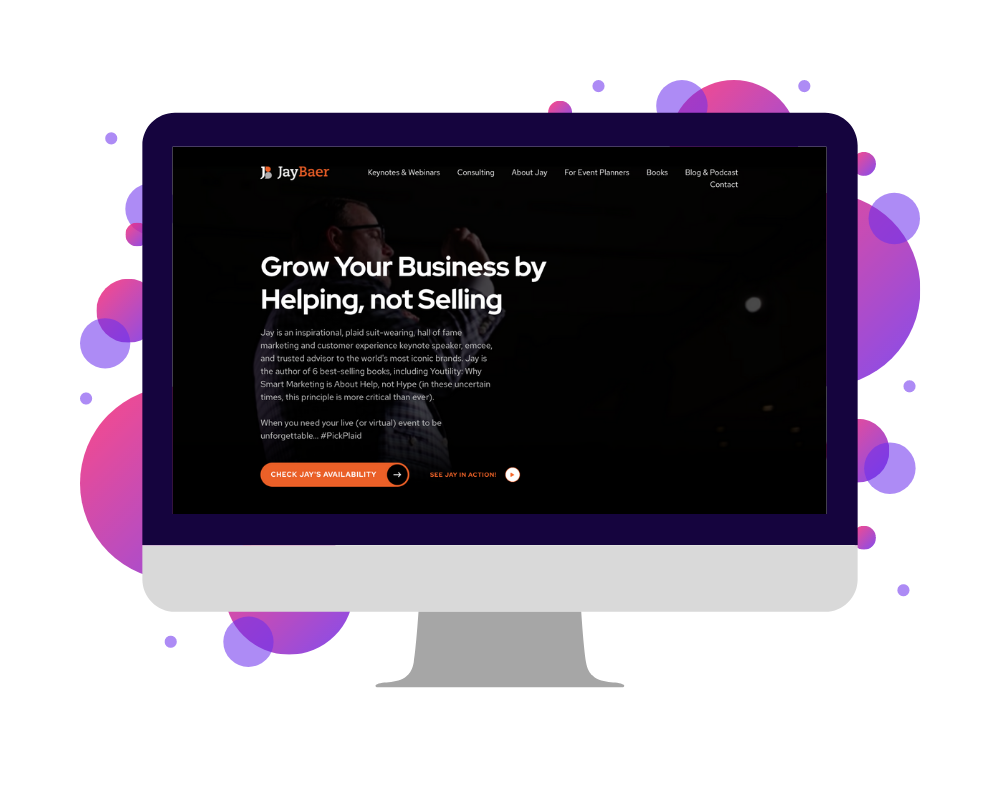
Next, let’s take a look at the website of keynote speaker, author, and consultant Jay Baer. Similar to those of Brittany Hodak, Cassandra Worthy, and Jason Redman, Jay’s site is a digital extension of his personality and highlights his unique and memorable approach to speaking. Design-wise and in terms of content, it’s also an exceptionally well-structured example of how to construct a site that is bold but also balanced. In other words, despite being visually striking, it also clearly communicates his focus and the value of hiring him.
What You Should Steal: His Uniqueness
Together, these elements show the importance of leaning into what makes you unique. For some speakers, this may be their speaking style, clothing, or personal brand “mottos”. For Jay, it’s a bit of all three, as shown in his #PickPlaid campaign, which appears in his branding, his dress, and throughout his website. With your own personal brand – and especially on your website – aim for a similar centricity around the things that make you stand out. Not only will it make you more memorable in the eyes of event organizers. It will also make it easier for all website visitors to see you as an approachable, relatable person, on- and off-stage.
11. Jeff Koziatek
The next speaker website belongs to another humor-focused thought-leader, award-winning entertainer Jeff Koziatek. Structured with a plain and clean-cut design, Jeff’s site is one of the simplest on this list. However, while it may lack the self-promotional flash of many thought leaders’ sites, it does an exceptional job of showcasing his personality and the purpose and power of his programs. It also features a wide variety of photos of Jeff being…well, Jeff! Instead of being stiff or “corporate-y,” the entire website highlights his approachability and how his speaking and coaching programs are designed to be encouraging and entertaining, not intimidating.
What You Should Steal: His Humor
Compared to the previous speakers mentioned here, Jeff stands out partly because of this authenticity but also because his humor isn’t simply a component of his speeches. It’s a part of his routine. This use of humor – in his presentations and throughout his website – exemplifies long-accepted research proving that making people laugh can also help them better remember you and your message. Considering this, don’t be afraid to incorporate the same relaxed and comical tone in your website. Best case scenario, event organizers see it, love it, and hire you. Worst case scenario, at least you give them a laugh and a reason to remember you.
12. Justin Forsett
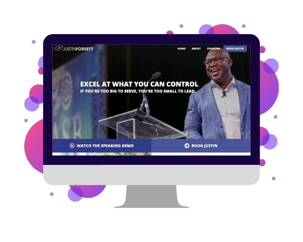
Number 12 of our speaker websites is that of speaker, business owner, and retired NFL running back Justin Forsett. With only a handful of pages and a simple design, Justin’s website may be one of the smallest on this list, but it’s also one of the clearest. Where many speakers unintentionally clutter their sites with photos or client logos, excessive calls to action, or loads of text, Justin’s website is instead succinct and precise about the ways to work with him and the benefits of doing so.
What You Should Steal: His Conviction
As a speaker and a thought leader, part of commanding a higher fee comes from being confident in your own worth and in your primary message. For Justin, this is apparent as soon as you land on his website, as the hero section states, “Excel At What You Can Control: If You’re Too Big To Serve, You’re Too Small To Lead.” When designing your website, bring the same conviction and confidence to your language. Ideally, everything on your website should say to event organizers, “I’m the best at what I do, and you can be, too. Hire me, so I can show you how”.
13. Justin Jones-Fosu
Thirteenth in our list of speaker websites is keynote speaker and coach Justin Jones-Fosu. Unlike the previous examples we’ve covered, Justin’s website is unique in that, rather than focusing on a single audience for his presentations, he segments his website into two distinct units: business and education. For each of these parts of his site, Justin uses different colors and design elements to further differentiate the information relevant to each group. He also uses different photos and language, so that the branding and message remain cohesive for each audience.
What You Should Steal: His Use of Images
Looking at Justin’s photos, specifically, there are a few things to note for your own use. First, he includes images that show him in action, so event organizers can already picture him on their stage. Second, they’re high resolution, so no matter which device – phone, laptop, tablet, etc. – someone is using to view his site, they can see him clearly. And, lastly, in all of his photos, Justin’s clothing colors and style coincide with his brand, so that his entire site looks polished, like it was truly made to show him in the best light. With your photos, keep these guidelines in mind to highlight your own positive attributes: balance action and headshots, use only high-res images, and always be on-brand. 👌
[hubspot type=cta portal=5815852 id=e68abcd9-8ad0-4673-81d2-450b59a97afc]
14. Katrina Cravy
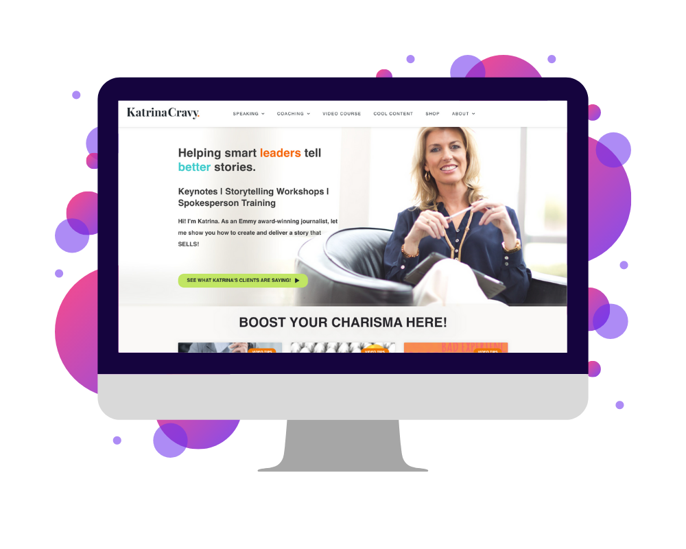
The fourteenth speaker website we’ll look at is yet another SpeakerFlow-led project, that of Emmy award-winning journalist and keynote speaker Katrina Cravy. Due to her background in news, Katrina’s site balances resources and information with mentions of her speaking programs. This includes regularly published blog articles, a video course, and her book. Like many of the speakers mentioned here, Katrina also includes a “For Event Planners” page, making her speaking resources easily accessible for anyone hiring (or thinking about hiring) her.
What You Should Steal: Her Contact Page
One page many speakers overlook is the “Contact” page, in many cases just slapping a form on it with the header “Talk to Me”. On Katrina’s “Contact” page, however, you’ll also find an embedded calendar, allowing site visitors to quickly and easily book a meeting with Katrina. By doing this, she makes it as convenient as possible for event organizers to connect with her within their busy schedule, already demonstrating her commitment to their needs and increasing the likelihood their discovery call will turn into a gig. When building your “Contact” page, include a booking system, like Calendly or Mixmax, to do the same.
15. Mel Robbins
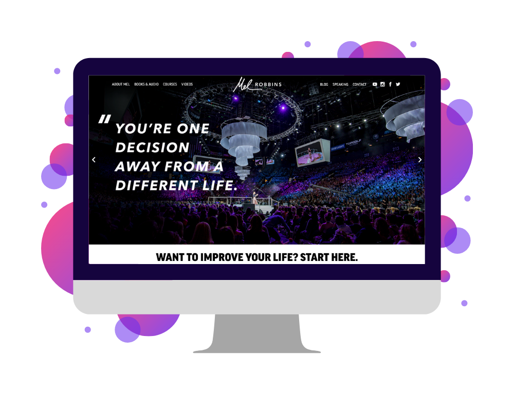
Next up – and a website you probably knew would make this list – is that of world-renowned motivational speaker Mel Robbins. Among thought leaders (and, arguably, the general public), Mel is known for a wide variety of reasons including her regular motivational videos, her collection of audiobooks, and her 2011 Tedx Talk. She’s also known for her candid and relatable approach to thought leadership, a mindset that is evident in the unique and incredibly modern layout of her website and content alike. Unsurprisingly, all of these characteristics, combined, make Mel hard for audience members to forget and even harder for event organizers to turn down.
What You Should Steal: Her Wide Range of Content
Although many speakers don’t reach the level of fame Mel’s accomplished in recent years, there are a few elements of her brand to mimic, no matter how large or small your speaking business, including her content channels. I mentioned above that Mel shares a lot of content, including books, blogs, and videos – even a tv show! Admittedly, the last one of those is a bit of a long shot. But, the others are more than attainable and of growing importance among speakers that want to stand out from the crowd. If that includes you (and believe me, it does), invest time and energy into building these content channels. Then, promote them on your site, as Mel does.
16. Nick Vujicic
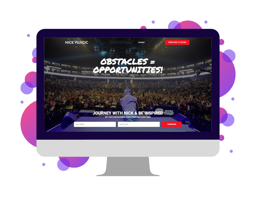
The next entry in our speaker websites list is that of motivational speaker, author, coach, and entrepreneur Nick Vujicic. An Australian-American, Nick was born without arms or legs and, although he faced bullying and extreme depression as a young adult, ultimately transformed himself into an anti-bullying advocate. Today, his website centers around this mission of “inspir[ing] and equip[ing] the world to know that we all can rise above adversity and overcome every disability of the heart and mind”. Besides his speaking programs, this largely means highlighting his service efforts, such as the creation of his Social Emotional Learning (SEL) Curriculum for schools and the non-profit ministry Life Without Limbs.
What You Should Steal: His Use of Color
When considering the design of your website, it’s imperative that you don’t underestimate the importance of color. It sounds small, but throughout Nick’s site, one of the most striking elements is the color of his call-to-action buttons, the majority of which are bright red. Compared to the blacks, grays, and blues that constitute his remaining brand colors, this makes the buttons especially eye-catching, urging the viewer to click the engage with Nick. On your own site, plan your calls-to-action with the same attention to color and placement, so your own website visitors won’t be able to help clicking “Talk to me!”. 👍
17. Ozan Varol
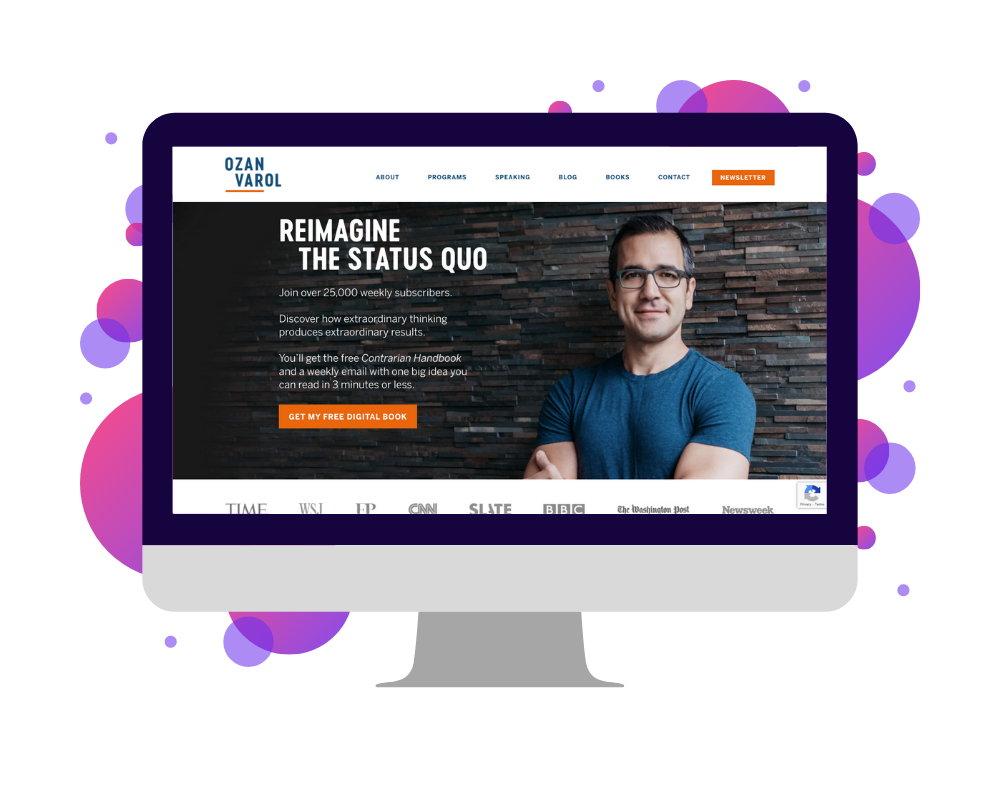
Seventeenth in our list of speaker websites belongs to former rocket scientist, author, and speaker Ozan Varol. Unlike most of the people we’ve covered here, Ozan’s story starts in Istanbul, Turkey where he grew up before eventually moving to the U.S. at 17. Since then, Ozan’s bio has come to include a collection of notable events, such as the 2003 Mars Exploration Rovers project, his graduation from law school, and his current growth as a thought leader. Throughout his website, these diverse and inspiring experiences are reiterated in Ozan’s messaging, speaking programs, and newsletter theme.
What You Should Steal: His About Page
I’ve mentioned a few times that making yourself relatable as a person makes you more impactful as a speaker. One way to do this, as shown on Ozan’s website, is simply through your “About” page. Here, although he could have opted for a plain text bio or timeline, Ozan instead shares more intimate details about himself, saying “I’m a husband. Dog father. Law professor. Soccer lover. Movie watcher who still gets Netflix DVDs in the mail”. Likewise, on your own “About” page should include your bio, but it should also show who you are. When building it, ask yourself, “What makes me special?” and “What details make me a good family member and friend?” Then, sprinkle some of those details throughout your website, to add some personality to your professional presence.
18. Rachel Blackston
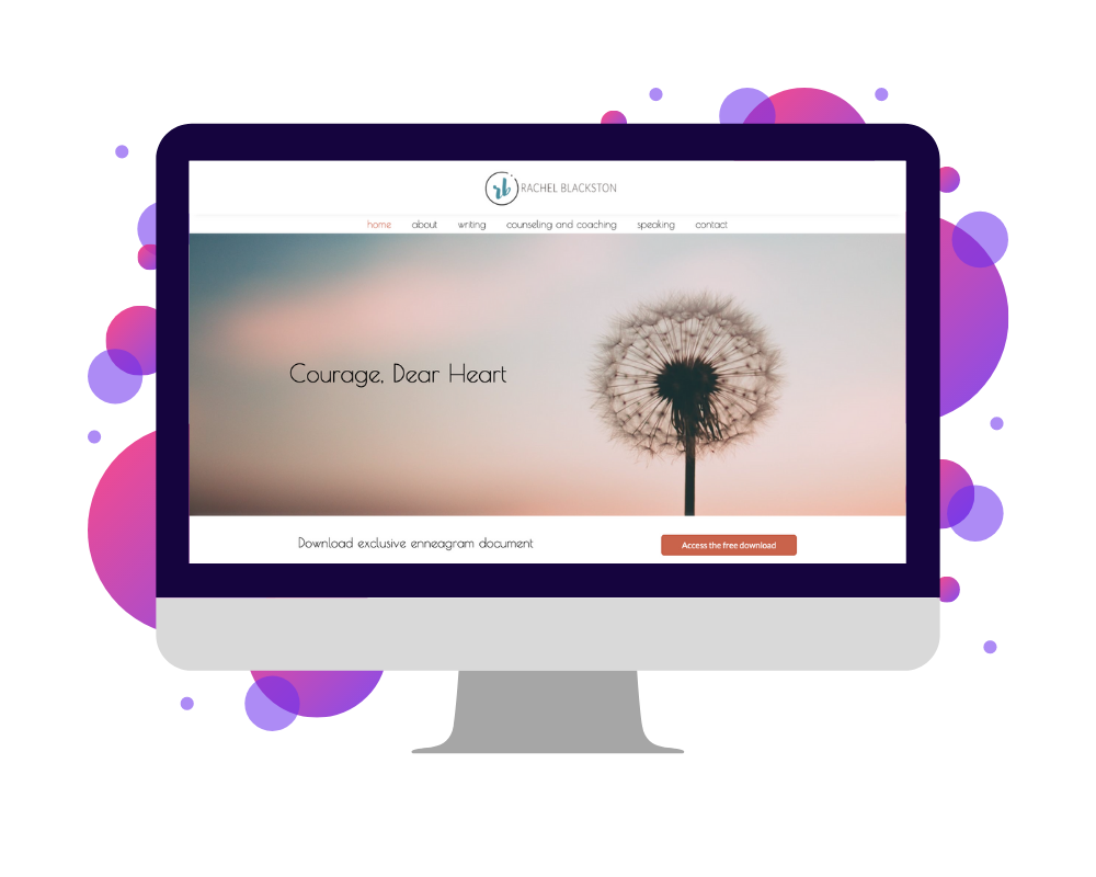
Next up is another clear and uncomplicated website design, that of speaker, counselor, and coach Rachel Blackston. Another design from Candid Goat, this website is the only one in this guide to focus on a religious speaker rather than one in business or education. Considering this, Rachel’s website is another example of how to design a website that represents your personality and your values, in this case, her dedication to family and spirituality rather than the usual “corporate” theme of most speakers’ websites.
What You Should Steal: Her Logo & Icon Style
In terms of design, specifically, another notable area of Rachel’s website is her logo and icon. Like the use of color on Nick Vujicic’s site, your logo and icon may seem like small details. Nevertheless, when done well, both can help event organizers remember your speaking business and, by extension, how awesome you are. In Rachel’s case, this means a modest and modern design, complete with her initials. With your own logo, it can mean bold colors, striking graphic elements, or even an illustration instead of your initials. Whatever you choose, the goal is to provide a visual anchor for your personal brand. That way, people have an image to remember alongside your name. This makes them even more likely to come back to your website for more information.
19. Sally Hogshead
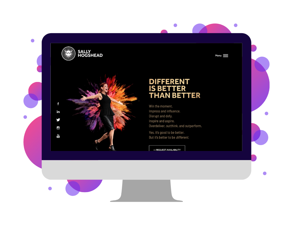
The next website in our list is owned by keynote speaker, researcher, and personal branding expert Sally Hogshead. Like Jason Dorsey, Sally’s website balances two components of her speaking business: her research efforts and the thought leadership programs in which she shares them. Additionally, like the majority of the speaker websites mentioned here, Sally’s also highlights her most significant clients, the outcomes they saw after hiring her, and the raving reviews they left behind. All of these elements are supported by a plain and monochromatic brand. This allows her images, gifs, videos, and research to stand out and provide further evidence for her credibility.
What You Should Steal: Her Topics Page
One question many established speakers run into is “I speak on a bunch of different topics. How can I share information about them all without overwhelming people with options?” Sally, for example, has roughly 15 different topics for her presentations, ranging from female empowerment to team communication. To share these choices with event planners, Sally’s website features a “Topics” page, complete with her sizzle reel and clips from each topic. This allows the viewer to conveniently watch and choose the presentation that best suits their event. On your own website, consider creating a similar page if you’re in the same situation, so it’s as clear and convenient as possible for any event organizers considering your work.
20. Shola Richards
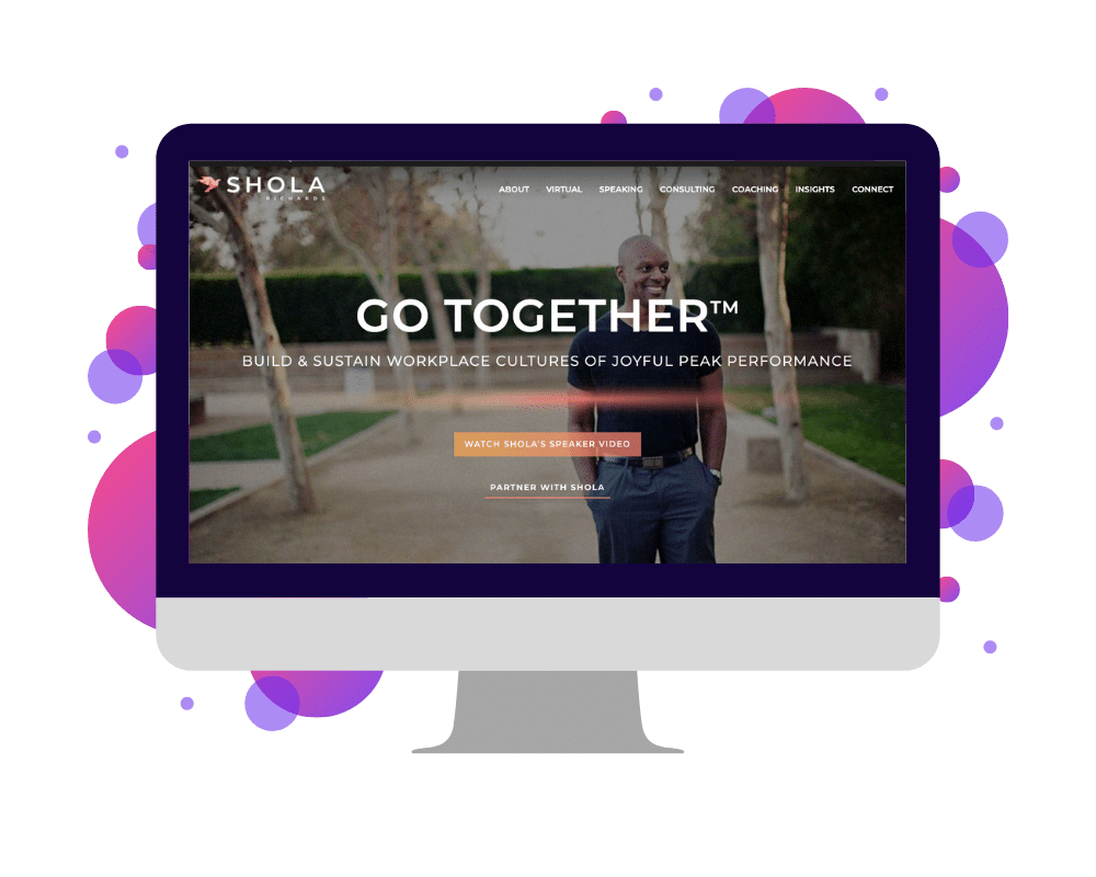
Number 20 of our speaker websites is peak performance expert and leadership speaker Shola Richards. Of the entries in this list, Shola’s is one of the most eye-catching for a handful of reasons. For one thing, his branding is a unique balance of modern and classic, light and dark, and masculine and feminine elements. In other words, rather than designing a brand to suggest a stereotypical personality, Shola’s website communicates his value and personality much as he might in person, as a unique and complex brand. It’s also a perfect example of what details – and “sections” of information – to include on your own website if you’re unsure.
What You Should Steal: His Animations
Besides the unique style and stellar layout, another component of Shola’s website you can adopt for your own is his use of animations. Depending on how many animations you use and how extreme they are, it can be easy to overwhelm the viewer. But, if they’re carefully placed and scattered throughout the site, they can instead add movement to dull areas or bring attention to especially important details about your speaking business. When adding animations to your website, keep this in mind and, again, look to Shola’s if you’re unsure what well-placed animation looks like.
[hubspot type=cta portal=5815852 id=7cff95fd-a207-455b-aed4-9364f424f159]
21. Sima Dahl
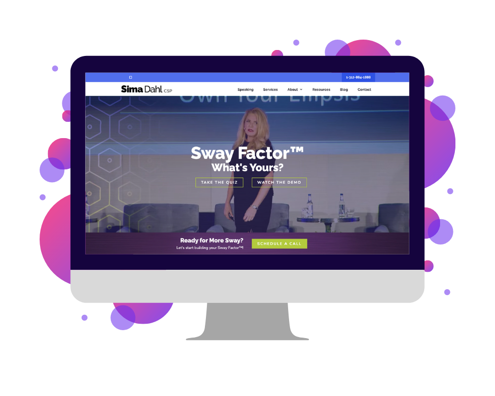
Twenty-second in our list of speaker websites is that of keynote speaker, consultant, and personal branding expert Sima Dahl. Another project from Candid Goat, Sima’s website is yet another example of what information you should include as a professional speaker and how to effectively communicate it through consistent language and branding. Like Christine Hassler’s website, Sima’s also expertly uses a free offering at the top of the page to capture leads. This allows her to not only build her email list and follower base over time but also collect qualified leads who land on her site, which she can then contact further to pitch her speaking programs. Plain and simple. 👌
What You Should Steal: Her Confidence
It goes without saying that, through all of these elements, the biggest thing you can take away from Sima’s website is the value of confidence. In her branding, photos, videos, and language – every aspect of her site – Sima is clear on two things above all. First, she knows what she’s doing and has the receipts to prove it. Second, if you want to get on her level, your best bet is to hire her. On your own website, you should communicate the same message to your audience. In your photos, graphics, speaking program descriptions be confident! The more you express confidence in yourself and your message, the more easily others will see that value, too.
22. Simon T. Bailey
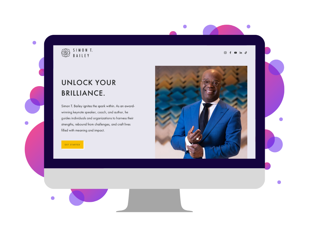
The 22nd speaker website belongs to one of the most well-known speakers in this list, that of Simon T. Bailey. For many reasons, Simon’s speaking business has featured in many of our blogs. Looking for modern, clean-cut branding? Look at his website. How about inspirational language and proven approaches to speaking? It’s got that, too. Nevertheless, throughout Simon’s branding, the focus is always on the viewer. In fact on his home page, everything about his brand comes down to two sentences: “I adore you, I believe in you, and there’s not a thing you can do about it. Let’s get started.”
What You Should Steal: His Resources Page
Like Simon, many speakers get into the thought leadership business largely because they want to help people. If you’re reading this, you may be thinking that was your intention, too. Considering that goal, one element of Simon’s website I suggest you emulate is his “Resources” page. Here, he shares his recent articles and magazine appearances along with “downloadable freebies” for his readers. Likewise, on your website, make sure you’re not simply promoting your speaking programs but also providing value for your visitors. It can be blogs, videos, downloadable content. Whatever you choose, make sure it suits your audience and shows your belief in your message.
23. Stephen Shapiro
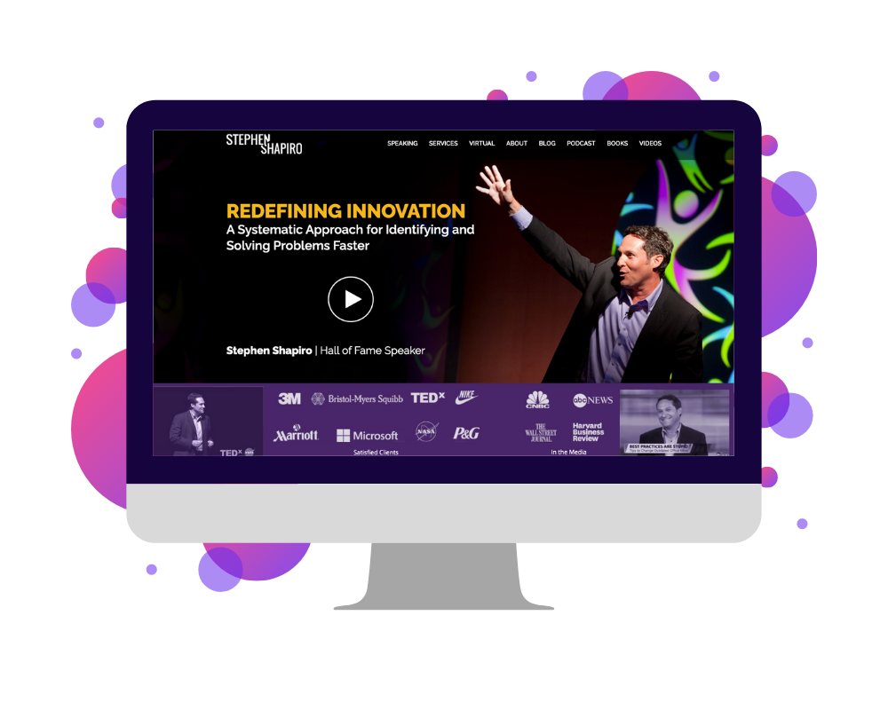
Next up on our list is author and award-winning speaker Stephen Shapiro. Within the events industry, Stephen’s gained a reputation in recent years not only for his speaking skills but also his ability to scale a speaking business. On his website, both of these skills are evident, like many in this list, through his relatively modern branding, concise and strategic sales language, promotional photos, and strategic call-to-action buttons. Like Dan Thurmon, Stephen is also one of an increasing number of speakers to highlight his virtual speaking skills, as the popularity of virtual events continues to climb.
What You Should Steal: His Virtual Speaking Page
Speaking of virtual events, if you haven’t yet considered virtual speaking, now is the time to do so. Over the last year alone, the number of virtual events has dramatically increased. It’s also projected to do so for the foreseeable future, due to the cost and time savings of hosting a virtual event and the ease with which people can attend. In light of these changes, over the next year, plan virtual variations of your own programs, if you haven’t already. Then, craft a “Virtual Speaking” page like Stephen’s, so you can tap into the virtual speaking market.
24. Tim Tebow
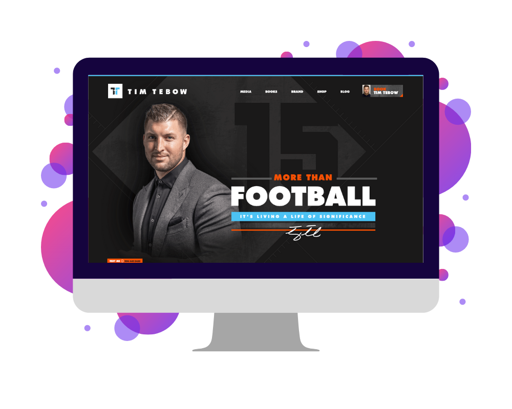
Number 24 of our speaker websites is that of motivational speaker and retired professional sports star Tim Tebow. As you’d expect, due to his fame and the corresponding budget of his business, Tim’s website is one of the most robust and well-branded entries in this list. In addition to the standard information of a speaking site, it also features an online store in which to buy Tim Tebow-branded merchandise, details about his TV and movie appearances, and information for companies seeking to hire Tim as a brand ambassador. Obviously, for most speaker websites, these additional elements aren’t applicable.
What You Should Steal: His Navigation Bar
That said, despite Tim’s celebrity status, one thing you can imitate on your own website is his navigation bar. If you don’t know what a navigation bar is, essentially, it’s the thin menu that runs across the top of your website, allowing visitors to easily jump from page to page. On Tim’s site, rather than using words alone, the navigation bar expands (when hovered over) to share a snippet of content for the corresponding pages and images to engage the reader. In the same way, on your own site, using a larger navigation bar like this allows you to share extra information and, in doing so, entice website visitors to check out other pages.
25. Tony Robbins
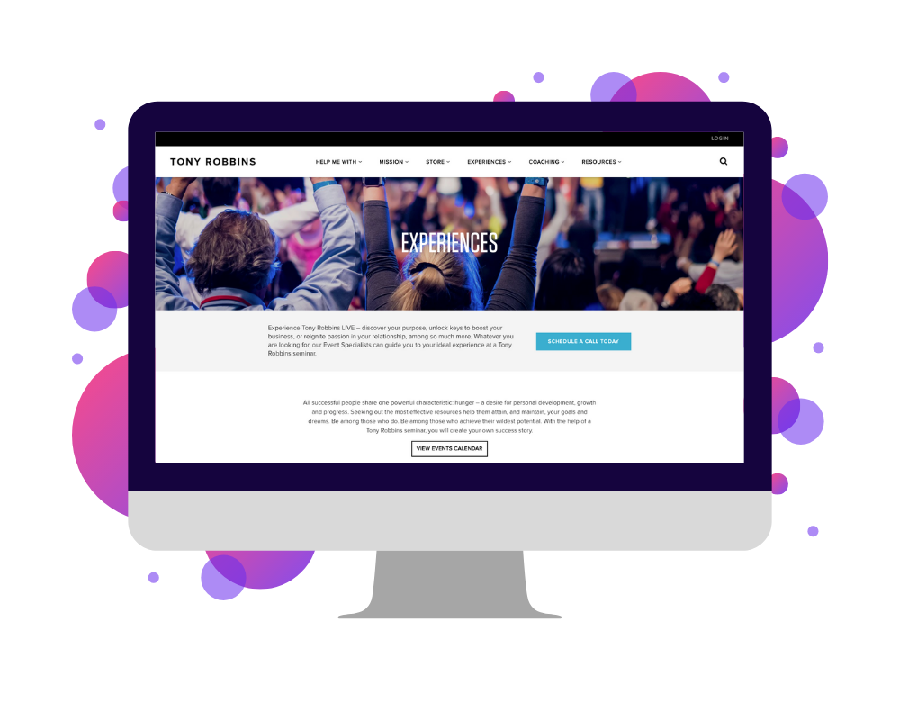
Finally, the 25th and last of the speaker websites we’ll break down here is that of Tony Robbins. As far as motivational speakers go, Tony has, for years, been one of the best known around the world. In addition to his speaking programs, his brand consists of a number of other branches that share his thought leadership. These include books, blog articles, a podcast, training systems, videos, even a Netflix documentary. As you’d expect, all of these components are uniformly branded, regularly updated, and made easily accessible through his website.
What You Should Steal: His Mission Descriptions
Besides all of his content, however, one of the biggest takeaways from Tony’s site is his mission. Like many thought leaders, Tony’s brand stems from a desire to have a positive impact on the world. On Tony’s “About” page, specifically, one section highlights his philanthropic efforts, mentioning his “World-Wide Impact”. In the same way, your own website shouldn’t just explain what you do but also why you do it. Ask yourself, “What’s my mission?” and “How am I giving back to the people that look to me for thought leadership?” Then, make those answers part of your brand moving forward.
Conclusion
Ultimately, the exact details of your speaker website are entirely up to you. If you’re an up-and-coming speaker, many of the websites above might be overkill, and you’d be better off starting small. On the other hand, if you’re an established speaker, many of the sites above can serve as click-for-click inspiration. That way, in the coming months, you can reach the success many of these speakers already have.
For more information about building speaker websites, check out our free “Website Checklist” on our Resources page. Alternatively, for more personalized advice, check in with us for a discovery call! We’d love to meet you, and who knows? Maybe the next time we publish our list of favorite speaker websites, you’ll be on it, too. 😊
Note from the SpeakerFlow team: Please note that we, as a company, do not have an affiliate relationship or a similar agreement of any kind with the speakers in this list. Our intention is purely to provide you with a single place to view these websites and derive inspiration for your own.
Please note, also, that because of the ever-evolving nature of design, the websites above are bound to change in the years following this guide. If you come across any inconsistencies or would like to submit a website candidate of your own, please reach out! We’re always looking for resources to share with the speaking community, so the more website inspiration we can put out there, the better. 👍